SERVICES

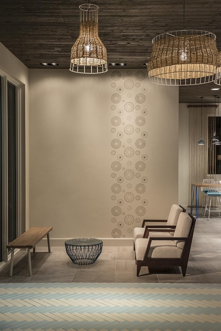
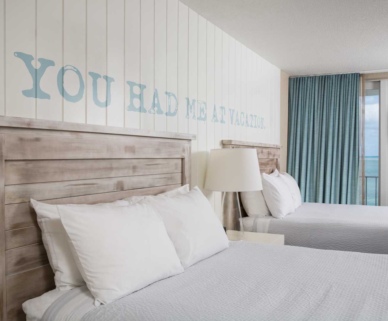
Strategy. Branding. Graphics. Interiors. Custom Furniture and Lighting. FF & E Concept Development. Naming. Brand Strategic Framework documentation and implementation.

The Story

Iconic Americana

THE LOWDOWN
Postcard Inn began its life in the mid 1960’s as a roadside escape called Holiday Isle. At the time, the Florida Keys were a hidden gem and truly a series of Holiday Isles. Over decades, the property had pieces and parts added and removed by various developers, operators and individual visionaries. When acquired by The Carlyle Group in late 2014, the mission was to simply create a modern American classic; not so simple.
THE CHALLENGE
The good news was we started our design/identity journey with an infamous property. The bad new was we started our design/identity journey with an infamous property. The directive was to preserve the property’s heritage and keep the spirit of the legendary elements intact. “This is not your Grandfather’s Postcard Inn” became our in studio battle cry. The sheer fact that so many memories had been lived and loved over generations provided a unique challenge for creating a new brand identity that was both scale-able, fresh and decidedly unique.
Postcard Inn - Lobby Interior
THE SOLUTION
We identified the cues that helped create this behemoth property into a modern slice of Americana Pie. Situated on four acres, the Postcard Inn has some of the most glorious and picturesque landscape in the keys. It is a one stop destination that previously had disconnected F&B outlets that needed more than new concepts. As the Keys are an experiential destination for so many, the conceptual strategy had to be a seamless transition between what was, what is and what would become. We made sense of the existing buildings by creating zones among the six hotel buildings and numerous outbuildings. Inside those zones we connected the journey through space with landscape and pathways. We relocated the hotel lobby to an old Exxon gas station that was demolished to accommodate a new free standing structure. Roadside Lobby meets Florida Keys architecture is the heartbeat and beacon for travelers on the Overseas Highway. This collaboration juxtaposed a timeless journey down Route 66 with classic Keys architectural details.
As locals are the bread and butter of all things Florida Keys, we were conscious to design spaces that had the authenticity of the original Holiday Isle. Simply, we provided food and beverage outlets that are both authentic and fun. “FUN NEVER GOES OUT OF STYLE.”
In a locale that is minutes away from Key Largo and a short drive from Fort Lauderdale/Miami and Key West, we created three distinct resort dining options, including the beloved and historic Tiki Bar. As a nod to it’s history and originality we created the tagline…
“THE ORIGINAL TIKI SINCE FOREVER.” It was, interestingly enough, made famous for the creation of the original Rum Runner cocktail in 1972. For a casual dining offering we created Ciao Hound Italian Kitchen & Bar, featuring classic Italian comfort food with fresh Florida Keys-sourced ingredients while catering to man’s best friend. A destination within a destination.
For the interiors, the hotel space brings together driftwood tile floors, rustic handcrafted furnishings, coastal inspired artwork and private sitting areas with resort and ocean views. From crisp, white bedding and whitewashed headboards to nautical accents with pops of navy, turquoise and sky blue, the cottages deliver a fresh island style. Equipped with a flat screen TV, mini-fridge, microwave and Wi-Fi, some cottages offer a kitchenette, supplied with china, glassware, flatware. The tucked away abodes follow the Postcard Inn tradition of hand-painted quotes from great American novelists on the walls, welcoming guests to the whimsical, authentic uptake on an American classic. After all is said and done, “YOU HAD ME AT VACATION,” aptly summed it up.
Postcard Inn - Lobby Entrance
Postcard Inn - Lounge Area
Postcard Inn - Front Desk Detail
Postcard Inn - Cottages
Postcard Inn - Cottages Detail
Postcard Inn - Tiki Bar
TIKI BAR
TIKI BAR was a unique project that had the potential to be terribly received by the local community. The Florida Keys and its inhabitants are not kind to change. They have witnessed the rising tide of corporatism obliterate decades old landmark establishments without a thought or a whisper of consideration for the impacts on local life. TIKI BAR drew another line in the sand with the locals. We were charged with keeping the heritage of the local legend. The original was no longer structurally sound. We understood Tiki was a cultural icon to the island, the locals, as well as the countless number of tourists who visited it over the latter half of the 20th century.
Our approach was to rebuild the bar in it’s original footprint while redesigning the open graduated shed roof. This would allow the layout recognizable and familiar while creating a new vision for this iconic location. The main cross beam became the focal point of history for the design. Adorned with postcards, money, maps, business cards, all from the original Tiki Bar were re-applied here. The dock, which had to be reconstructed, provided reclaimed wood, many decorated with hand carvings by patrons. Accents materials collected over decades were re-purposed in the back bar and elsewhere throughout. The re-imagined space is an homage to its predecessor, maintaining the same memorable vibe.
CIAO HOUND
Located in a previously a failing chain restaurant, Ciao Hound provided the space a new lease leash on life. The design intent  was based around the community and experiential vibe that comes with the Florida Keys. Out with the old fish shack and crab pots and in with the new; a pinch more style and atmosphere that is unique to the Florida Keys. The interior is punctuated by dramatic lighting, quirky wall art, custom over scale wall coverings with a touch of traditional Italian design cues. With design  a touch of wit and whimsy. With cues mixed with a touch of wit and whimsy, the combination of beach side resort and the traditional Italian restaurant was achieved. This combination provided a significantly more urban dining experience. The outside area continues this concept by introducing a new approach that includes design elements catering to a rarely thought of guest; man’s best friend.
While punctuating the play on words, Ciao and Chow, along with the properties dog friendly environment, we created water and food bowls, dog menus, and a mini-outdoor dog park on the patio, completing the moniker, Ciao Hound. Where you would expect to find walls adorned with photos of “Nona and family” cooking instead you see oversize dog art printed on sheets of CBX plwood, an enormous chalkboard with menu and hand drawn doodles, shelving with a cornucopia of glass jars filled with everything from olives to skittles candy. Ciao Hound presents itself as an unabashedly non-traditional Italian restaurant fit for man, his best friend, and the entire family. For the hostess stand, a re-purposed breakfront displays vintage original black and white Polaroids were curated to remind the millennials that they were in a property savored by many before them as we introduced a new concept and experience.

Branding & Identity

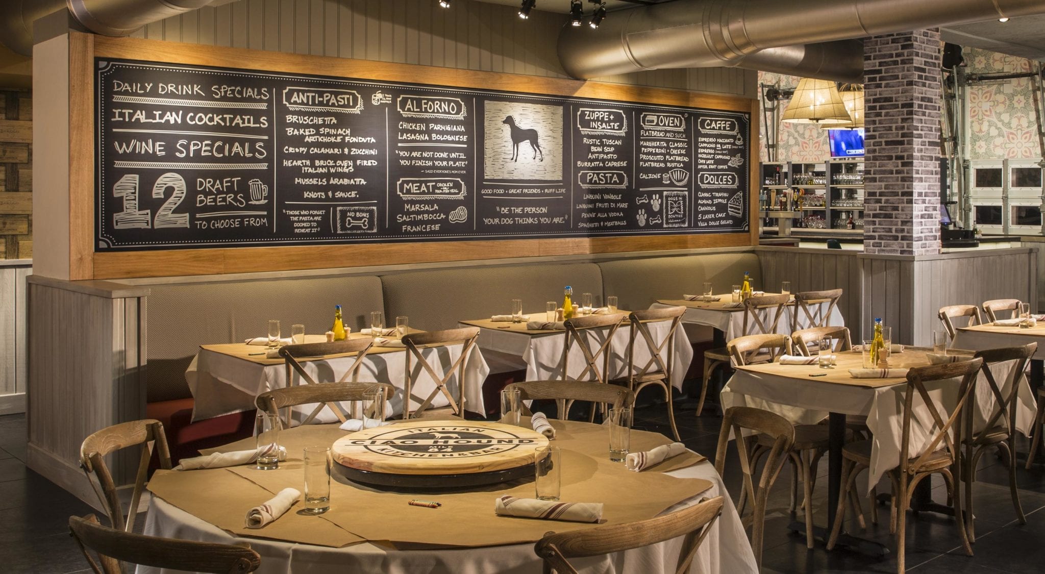
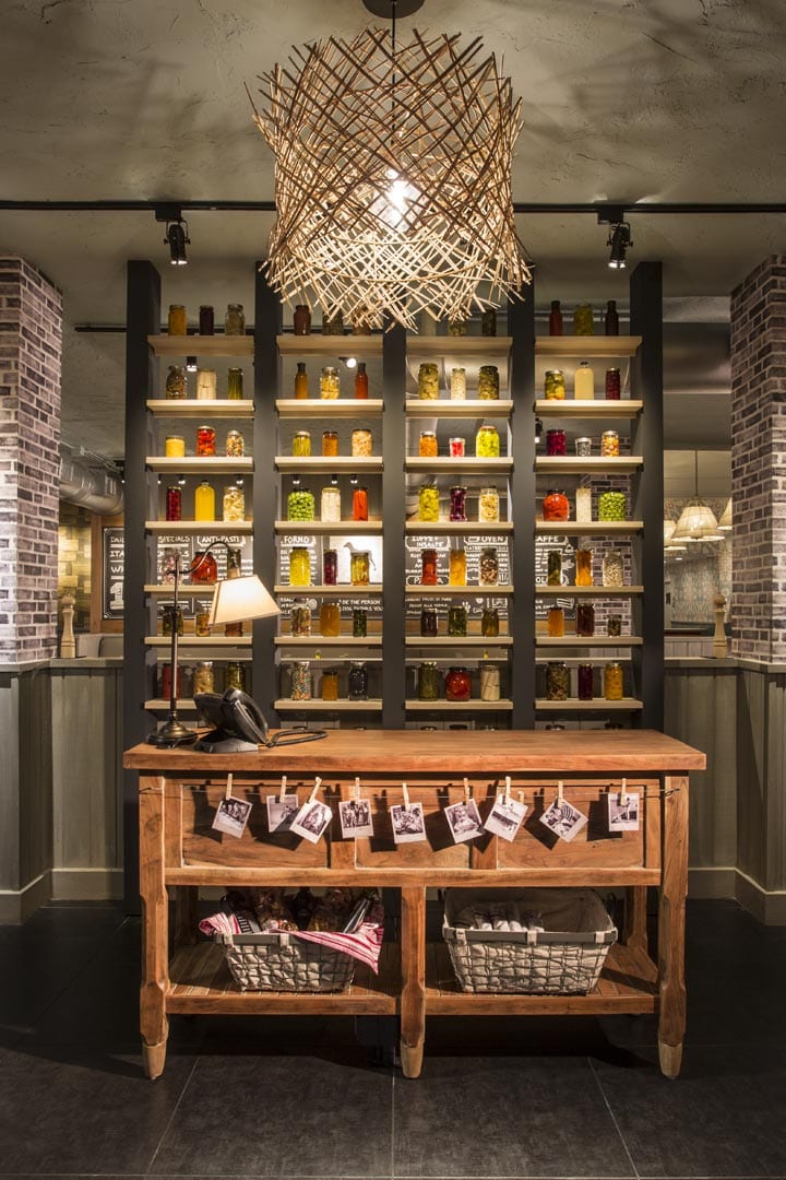
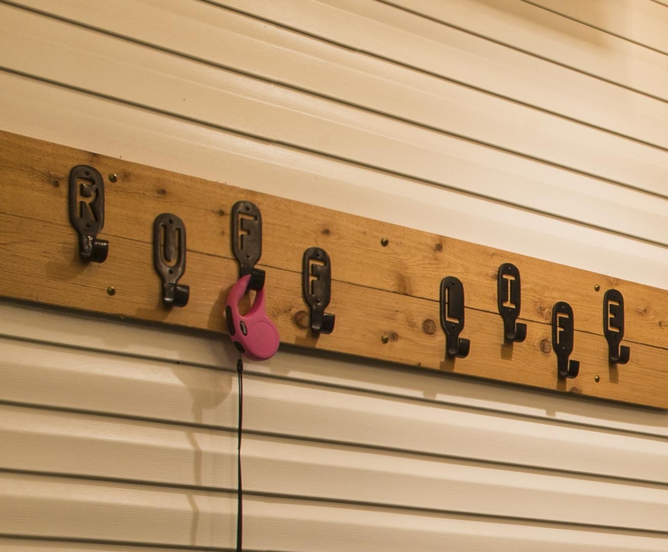
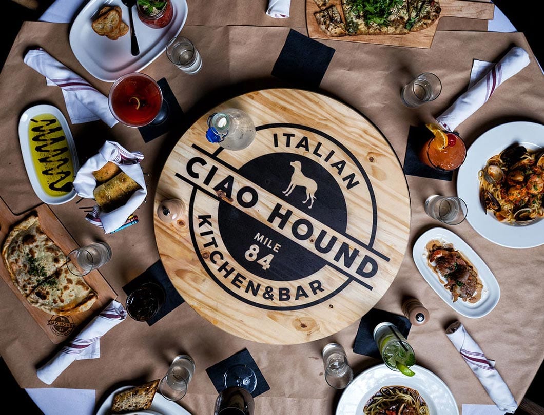
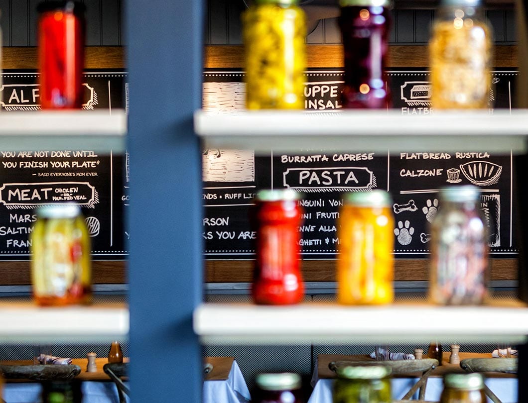
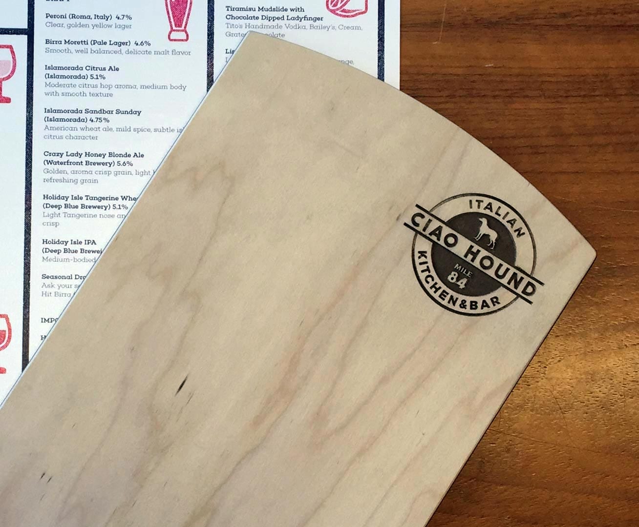
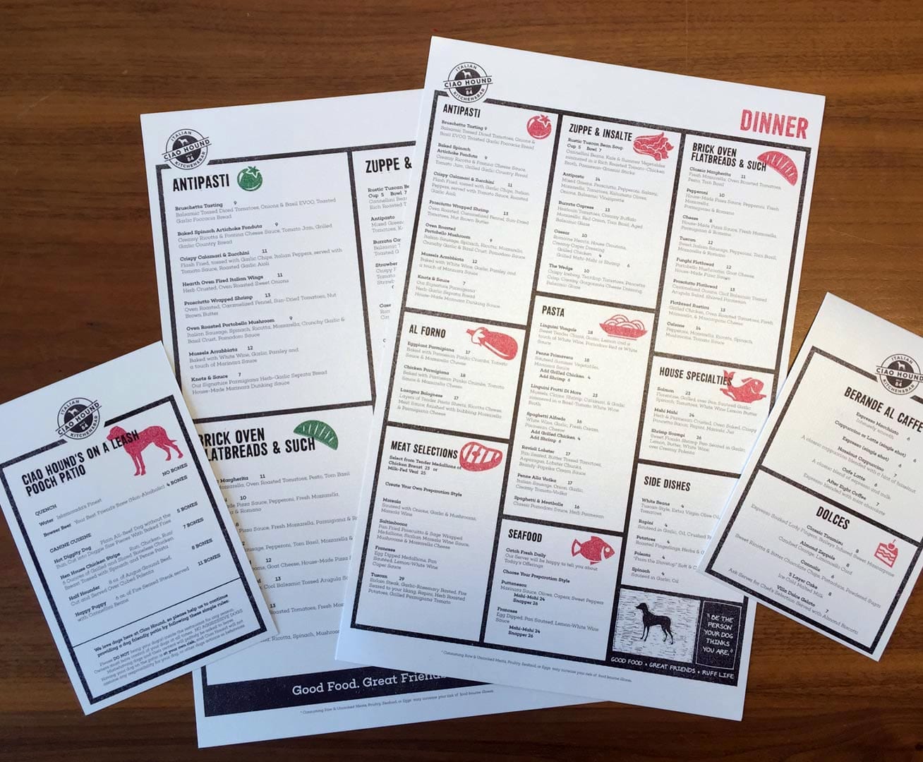
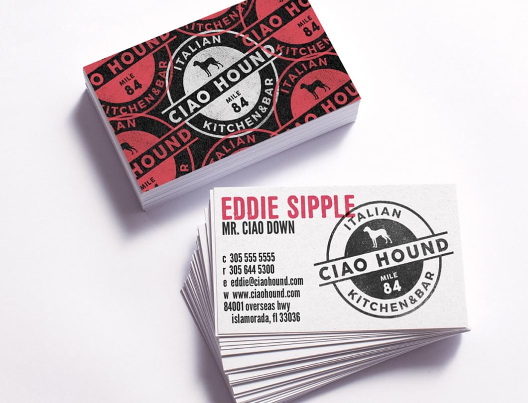
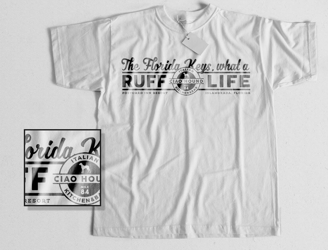
We designed the collateral pieces to carry the whimsical nature of the name. Business Cards. Menus. T-shirts. Dog Bowls. Serving Boards. All got the Ciao Hound treatment.

Custom Art & Signage

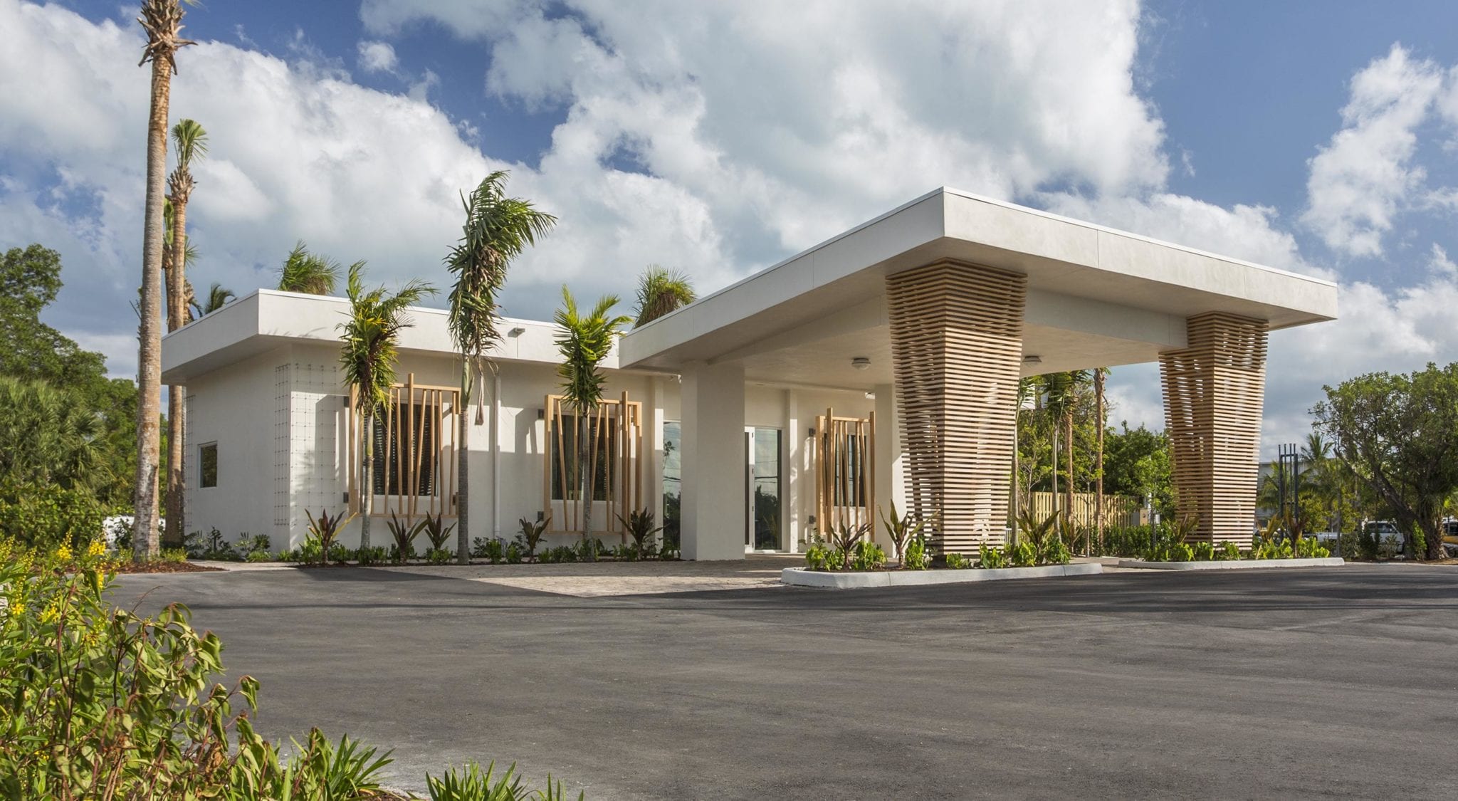
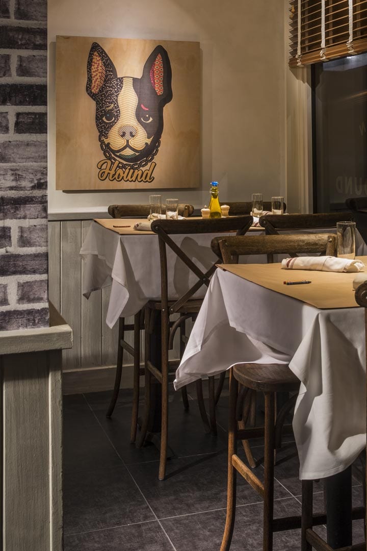
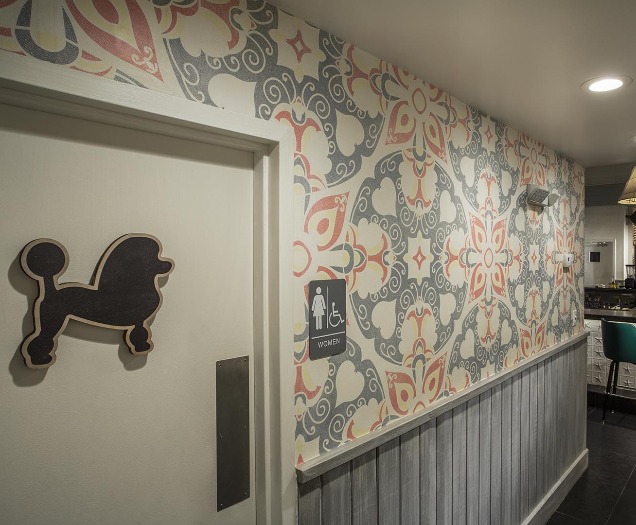
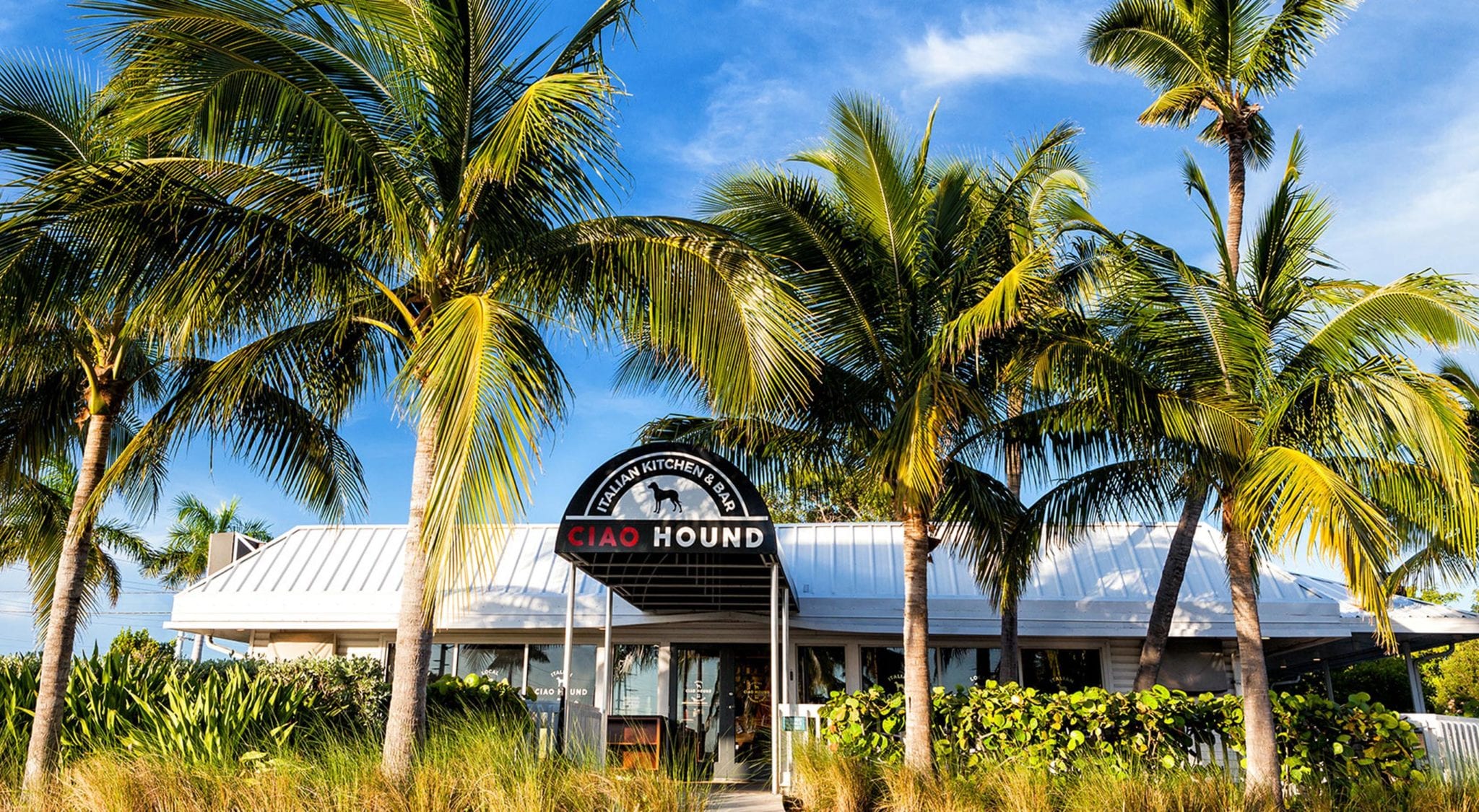
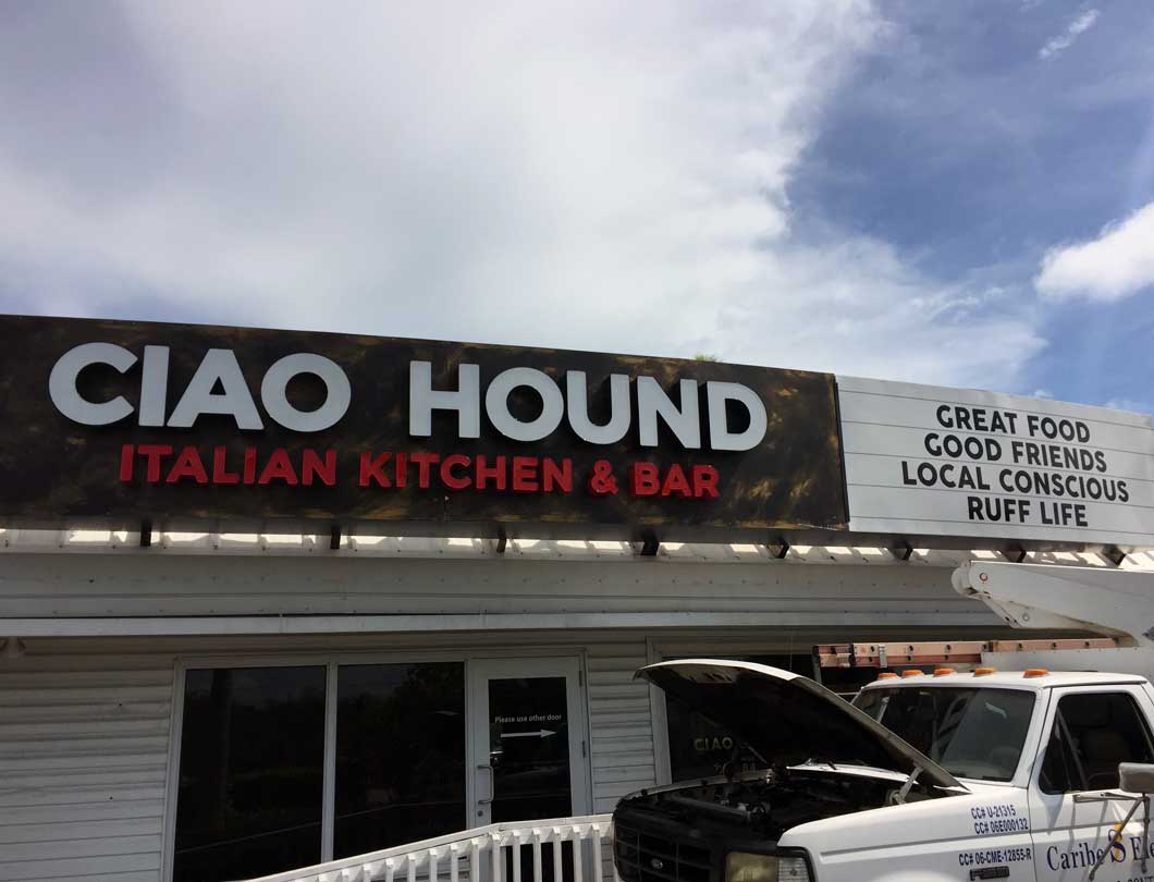
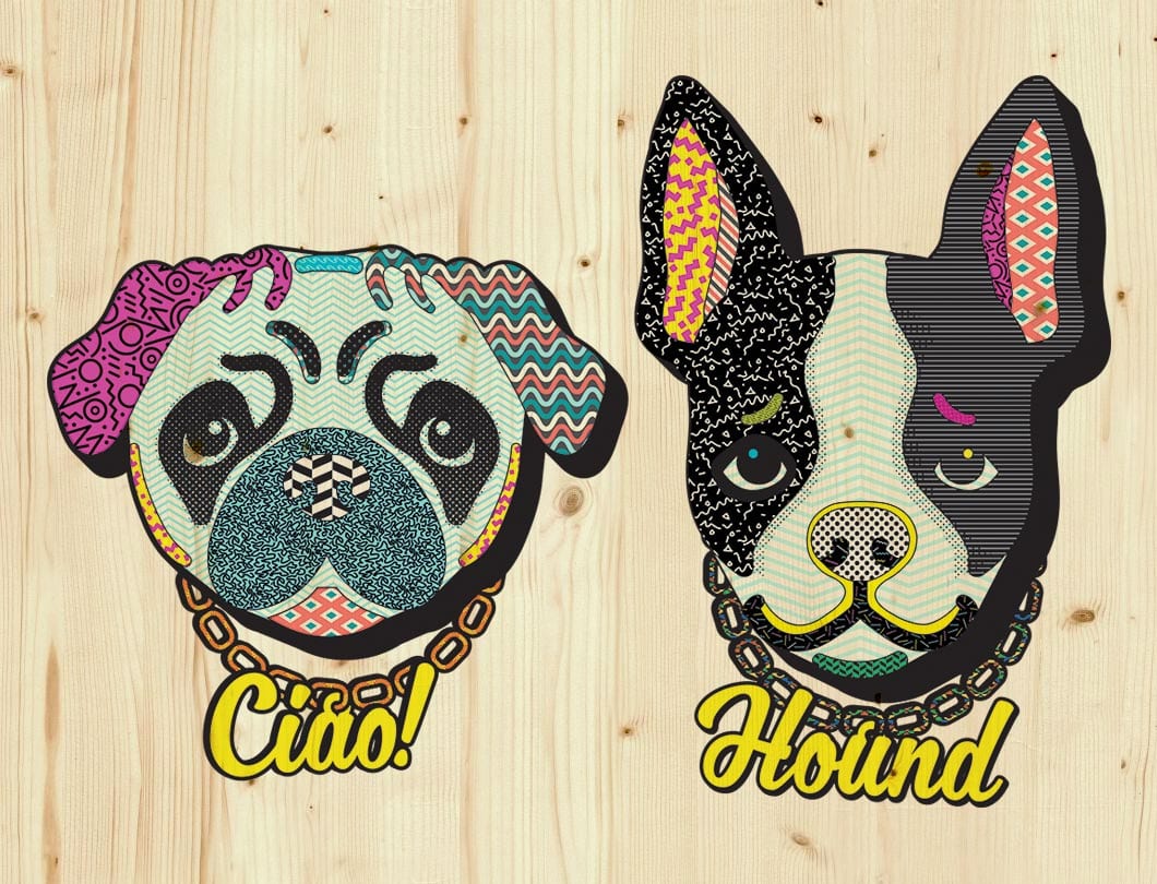
For art pieces we were inspired by restaurants that hang children’s colorings on the walls. We designed two custom hounds that hang on opposite sides of the restaurant with name plates on their collars; Ciao and Hound. The exterior required new signage panels retro-fit into the existing mechanics. We art directed these pieces to reflect the brand and maintain consistency.

CIAO HOUND LOGO

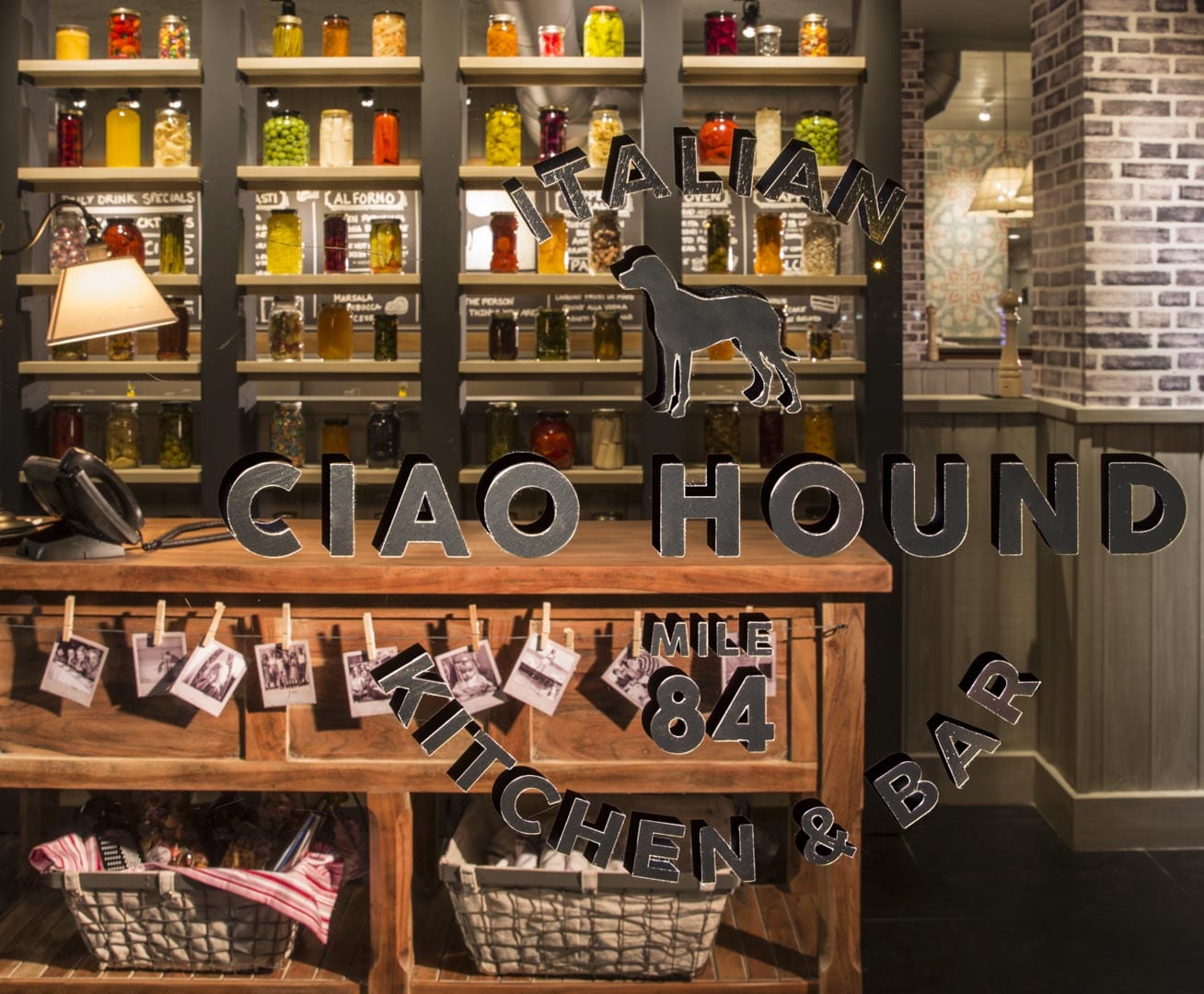
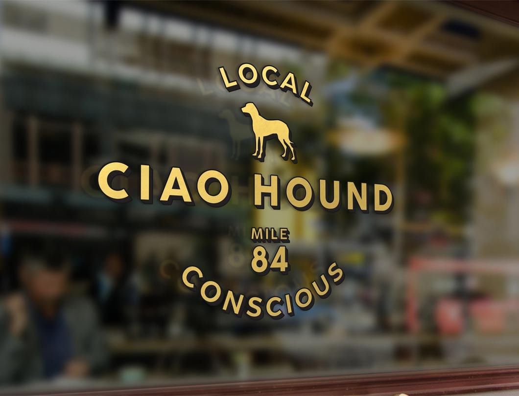
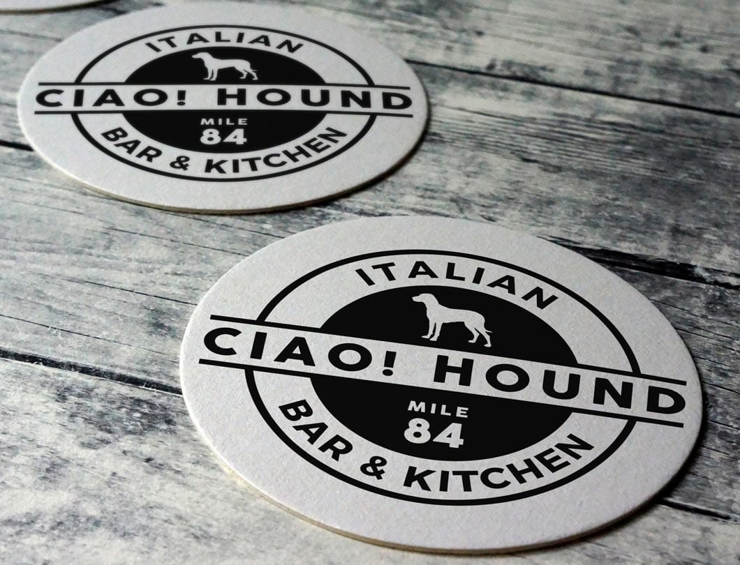
Ciao Hound’s logo needed to reflect the story and experience you expect when visiting. The play on words replacing “chow” with “Ciao” made a subtle reference to the cuisine. Locally speaking, Italian food is not as common as seafood, so we punctuated it with “Italian Kitchen & Bar.” The inclusion of the dog into the logo is not only a nod to the moniker but, most importantly, a badge of acceptance for dog lovers to bring along their best friends for lunch on the patio.  Finally, navigation being paramount in the Keys, we included “Mile 84” as a point of reference which locals and tourists use to quickly find shops, hotels and restaurants with ease.

Reel Burger

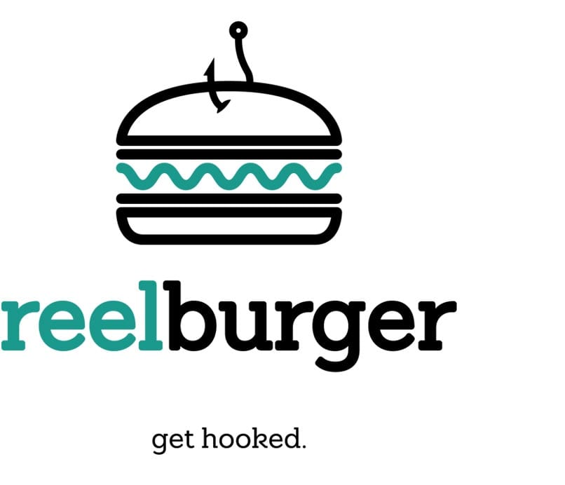
Name, logo and tagline developed for the burger restaurant in the Amara Cay lobby (sister property to Postcard Inn).  The client desired a less serious approach. After various rounds of exploring word play and various concept names we snagged a big one. Tying together fresh ingredients with the local fishing culture, ReelBurger was born. “Get Hooked.” We designed a logo that translates this nomenclature into a visual language using iconography, color and exaggeration.

Tiki Bar

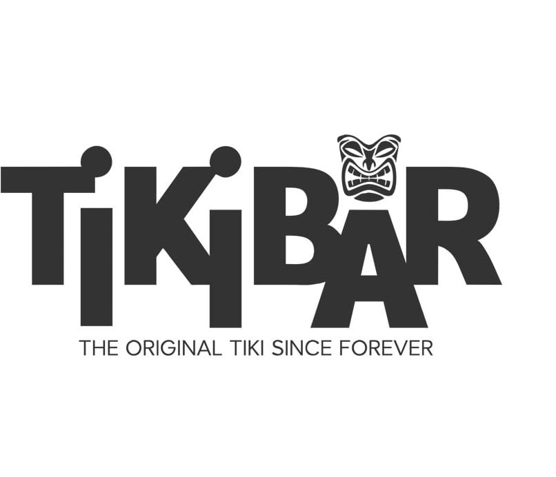
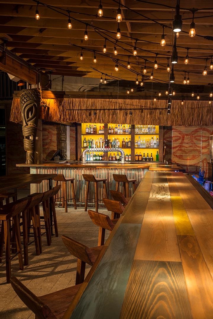
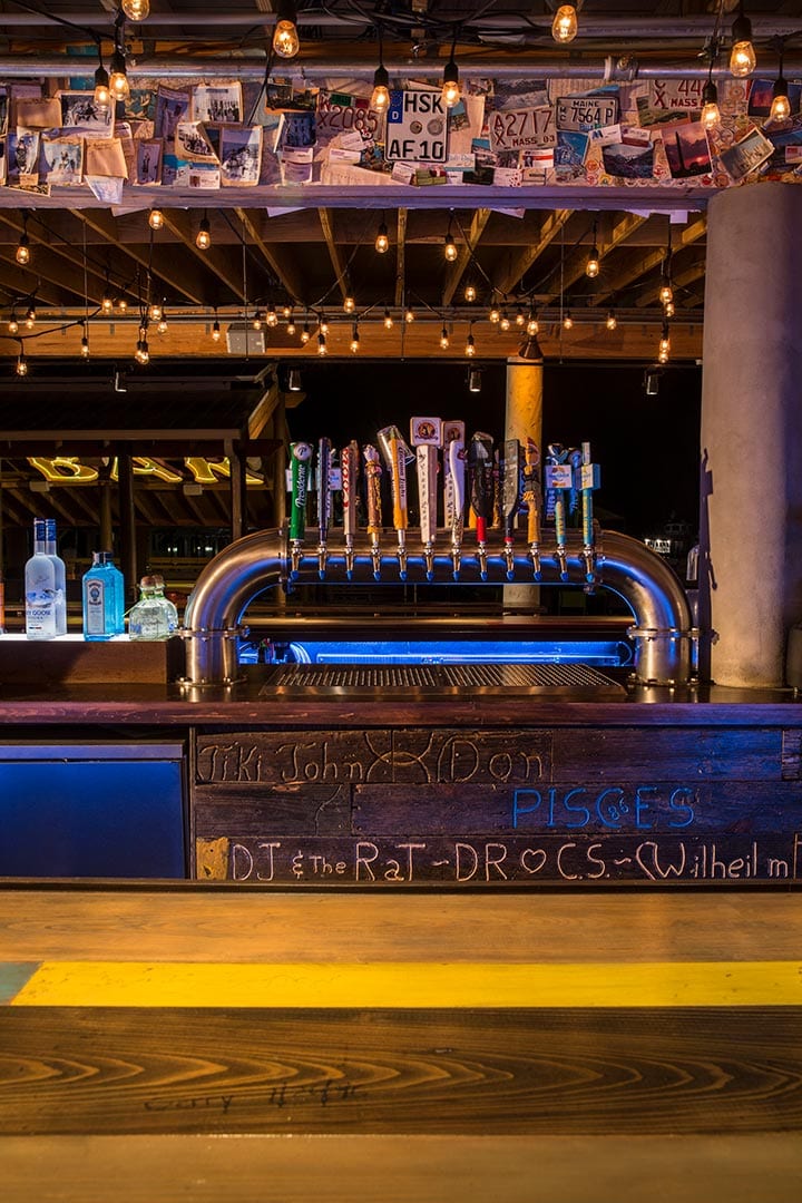
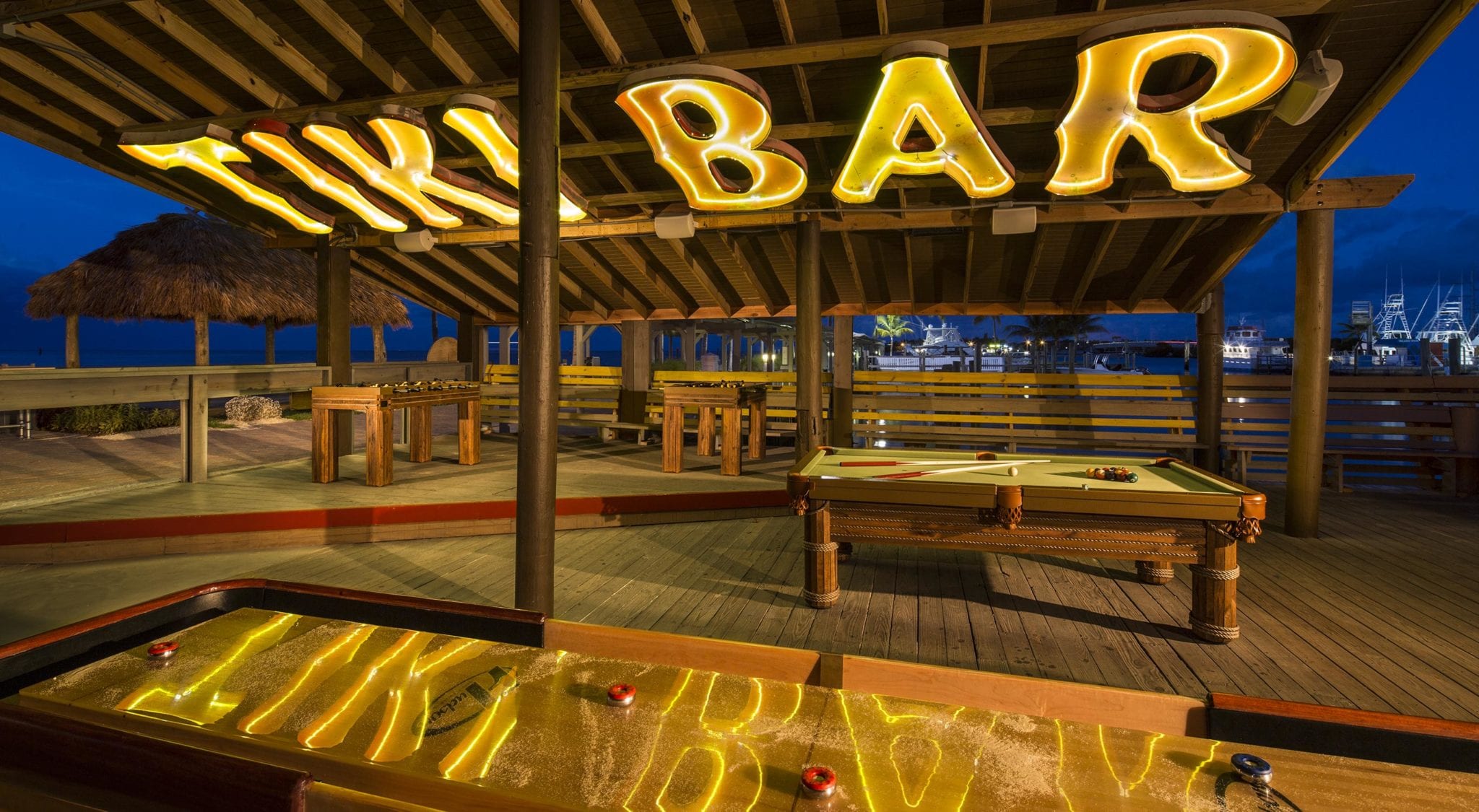
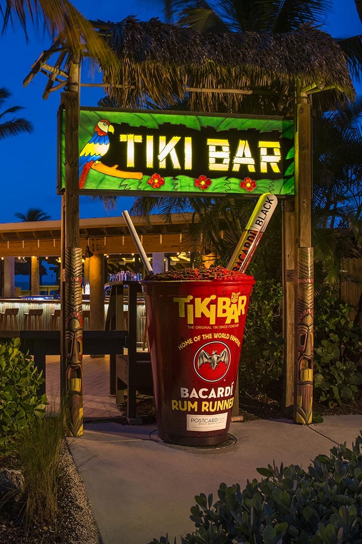
With the rebirth of Tiki Bar in physical form, the next challenge presented was to design a logo to reflect the new Tiki Bar while staying true to it’s famous origins. We approached this delicate balance by introducing a sans serif font not typical of the Polynesian type sets abound in tiki bar logos. It introduced a sense of newness while staying in line with the property’s chic, mid-century ethos. The inclusion of the face of the tiki warrior, and only the face, is a nod to it’s timelessness and partial reclamation. The tagline underscores the age and infamy of the hallowed space among Florida Keys travelers and locals alike.